Group Project Enrollment Prototype
Introduction to creating enjoyable UX designs
Aug 2021 - Dec 2021
Skills: Figma • UI/UX Design • Usability Testing • Prototyping
Coursework Project
7 min read
This project was done as part of a course in SMU, IS211 Interaction Design & Prototyping. The course mainly focuses on UI/UX aspect of designing applications, and there will be little to no programming involved throughout the course.
As early as week 2, our team had to start deciding on a problem that we want to work on and draft up a proposal. Our team (of 6) split into 3 pairs, and explored different problems and potential soulutions. Ultimately, we decided to move forward with the following problem.
"Students find it difficult to form groups due to many factors such as faculty's requirements, which groups have empty slots, and which currently still do not have a group."
Looking at the problem statement, we decided to propose a group matching tool that matches students based on different input parameters, from group fit to group sizing.
Essentially, this was an information inadequacy problem. The issue with grouping students was something our group felt collectively was a very apparent problem. From our experience, students often go through multiple channels (Zoom chat, email, slack, telegram etc.) in order to look for a group. With this, our group began conducting our initial interviews with the primary goal to validate our problem statement.

Our initial interviews solidified our hypothesis, and with that, we moved on towards the next stage of brainstorming for our solution.
We initially conducted a rapid ideation / brainstorming activity with sticky notes. Despite the infeasibility of some ideas, it was interesting to rapid-fire all our ideas so that seemingly-bad-but-good ideas will not be neglected.
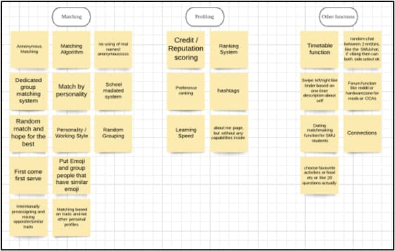
We further delved into the results collected from interviews, and realized that preferential matching algorithm may not be the best solution to solve an intrisically-human problem, and thus we went with having a more humanised approach, similar to that of dating apps.
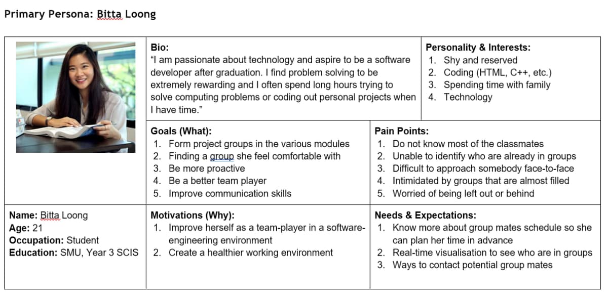
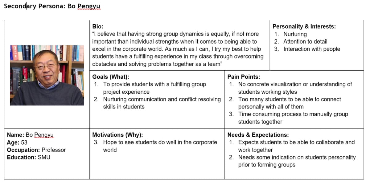
Before we moved forward with prototyping, we had to ensure that the personas we developed is able to sufficiently illustrate the pain points identified during our interviewing process.
We came up with two personas, one which represents the students having diffculties, and the other illustrates the faculty's problem in matching students to groups.
After coming up with adequate personas, we were encouraged by our mentor (teaching assistant) to create a paper prototype to capture the essence of creating a low-fidelity prototype without being carried away with how the final application should really look like. Here is an additional read-up which I thought summarises the purpose of lo-fi prototypes quite well!
Before creating our phyiscal prototype, we came up with a common navigation diagram and then proceeded to delegate the workload, each working on different views.

Meeting physically then allowed us to align our concept models and visualize the flow in terms of a high-level view on the whiteboard, which led us to finalise our lo-fi prototype.

We were initially afraid that our prototype was 'too low-fidelity', and that we were not able to gardner a lot of meaningful critique from the evaluating team. However, we were pleasantly surprised that the evaluating team had put so much effort into scrutinising our work.
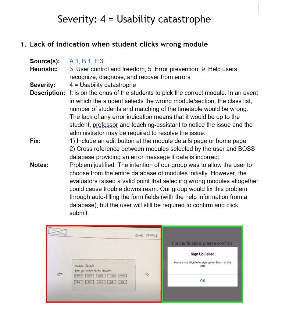
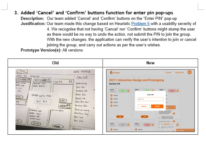
We proceeded to sort the evaluations according to the severity of the heuristic violations, based on Neilsen's Heuristics Usability Principles to Imrpove UI design.
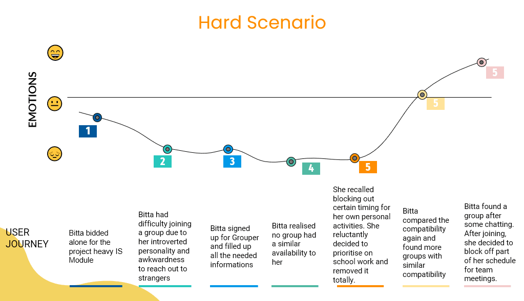
During iteration 1, the team came up with multiple user scenarios, one 'happy path' and another 'sad path', each representing a perfect situation where nothing goes wrong and an unhappy situation where everything goes wrong. This article summarises the concept quite nicely.
Our feedback from the initial presentation of iteration 1 was that our scenarios were lacking. We then revamped our 'sad path' which now depicts how our app allows the persona to take control of the situation and update their particulars in order to find a fitting group.
Our tool of choice to prototype was Figma. The final prototype map can be viewed here.
Before beginning our prototype development, we resolved the following outstanding issues highlighted during the first heuristic evaluation:
- Screen changes to tackle heuristic lapses > changed 23 out of 29 identified heuristic problems and ditched some features with a 'usability severity' of 4/5.
- Colors, Typeface and Standardization
- Roles and responsibilities > categorizing different screens into different processes, and each member (or pair) would then take on a process.
Less is more
The concept of "less is more" was introduced to us by our professors when they viewed our test designs. This article by Alan Smith summarises the benefits of this concept pretty well, that by "removing the bells and whistles, a minimalist design can offer higher user engagement, better usability, and an appeal that is more aesthetic".
We proceeded to conduct A/B Testing with a usability tool, Loop11.
Analysing the results, we concluded two things using Mann Whiteney U Test and observing Student's t-Test respectively.
- Version B was better than Version A in terms of intuitive design, as on average, participants in Version B viewed fewer pages than participants in Version A before achieving the objective.
- Version A and Version B have no significant difference in the time taken to complete the task specified (despite the difference in pages viewed).
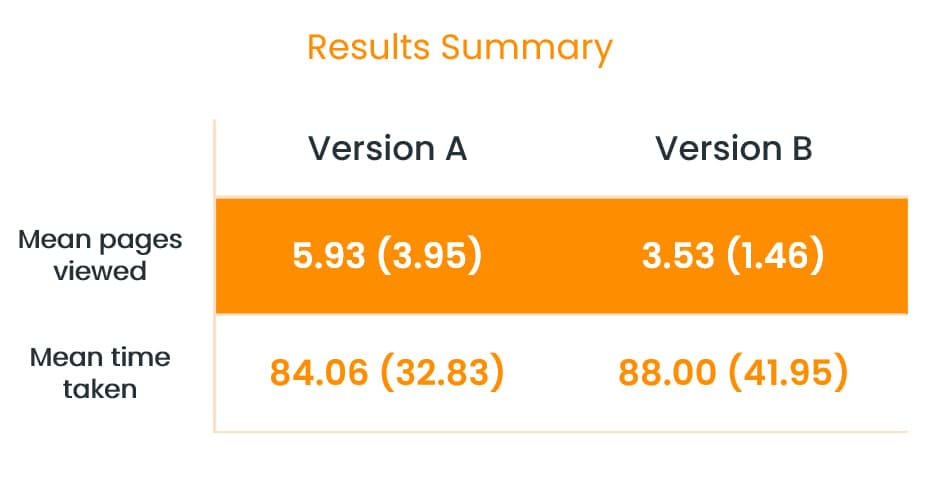
Participants in both Versions were able to achieve the given objectives.
We had only one minute to show our target audience what we wanted to do. Thus began our heavy editing process to ensure that important information was communicated, while retaining the essence of our initial storyboarding ideas and concepts.
We decided to roll with a "dating-app" concept as we felt like this was a good take on how a typical grouping process was, where people are essentially choosing and sizing up one another as potential groupamtes. Embed below is the final pitch for our app 😅😅
This module was a great taster into the entire life-cycle of designing a sound project, from ideation, collecting requirements, all the way up until evaluation. The team and I were able to gain a greater appreciation for design methodologies as a result.

Till next time, thanks for reading!